Single Photo Explanation/Discussion - Lines
Lines
So the idea of these single photo discussions/explanations is to take a single photo of mine and explain why I took it, why I edited it the way I did, and why I think it works and what I’d change about it looking back. I also want to open up a discussion as to whether or not it is a good photograph.
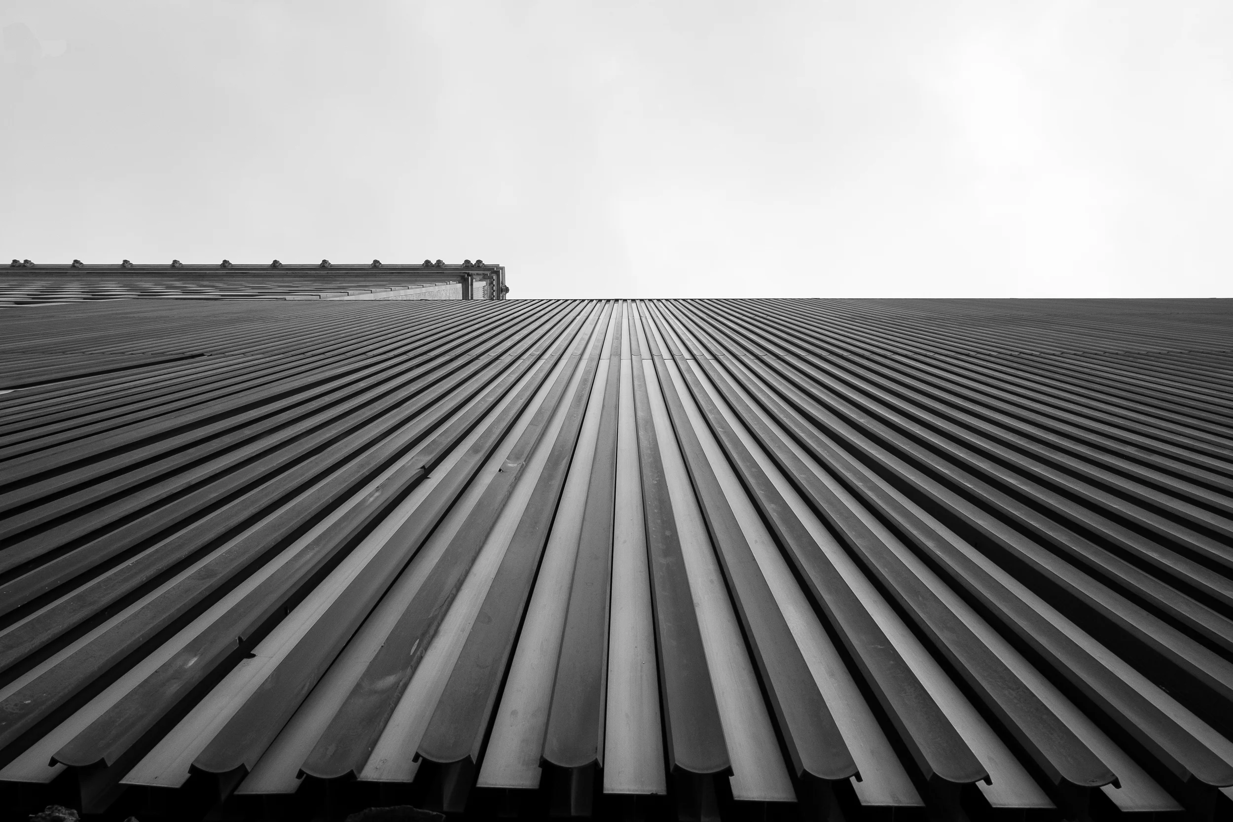
I get quite a few compliments on this picture, which was honestly pretty surprising when I first posted it. This is a parking garage in Downtown Houston. I am standing at the base of it and shooting straight up. The only remarkable thing about it is the lines in it, which is why I called it Lines.
Why I Took It
I took this picture because I was watching YouTube videos about interesting composition. Getting high and getting low were the name of the game. I saw the siding on this parking garage and thought it would be an interesting shot if I stood at the base of this parking structure and pointed my camera straight up.
Why I Edited It This Way
I always start my edits with a choice of black and white or color. I make that choice based upon whether I think the color in the shot adds anything to the shot that would be lost in black and white. If the shot would suffer by losing the color, color it is. If not, I always go black and white. Part of the reason is that I’m color blind and it makes editing the pictures much, much easier.
In this situation, the parking garage was not particularly interesting in terms of color and the sky was kind of an overcast greyish blue. I didn’t think that there would be anything lost in this image by keeping it color. Additionally, the composition is the interesting aspect of this image so taking the color out of it really emphasizes the composition and the leading lines elements (or at least that’s what I thought).
Why I Think It Works
I think this image works for a couple of reasons. The first is that it is a unique angle and a unique perspective on something ordinary. I guarantee you, if I took a photo of that parking garage from several yards away, no one would look twice at it. However, taking an ordinary items and looking at it from a different perspective is something that strikes a chord with people.
The second reason I think this image works is that it has quite a few traditional compositional elements in it. First, there are the leading lines. Typically, I like leading lines to lead to something (I’ll get to that in the “what would I change” section), but I think the lines in this image are still visually interesting and pleasing. There’s a lot of repetition in this image, which people tend to enjoy. Also, there is the rule of thirds present and the use of positive and negative space in that the top third of the frame is negative space with the bottom thirds are filled with the subject.
What I Would Change
Hindsight is 20/20, as they say. There’s a couple of things I would change about this image if I took it again (and I might as the parking garage is still there). I would take the picture a few more yards to the right of the frame and try to get rid of that other building on the left of the frame. This would clean up the image substantially and make it more visually striking and pleasing, in my opinion. The second thing I would change (if I could) is to take the picture again on a cloudier day or to wait for something to come into that top third of the frame. If that fails, I could always Photoshop something in, but my Photoshop skills are pretty poor, so that might come across as cheesy.
I think this image, as is, is pretty nice, but I think it could be much better with some simple tweaks and some more patience in my subject matter. However, taking a look at your own images with fresh eyes (I took this picture almost two years ago) and seriously critiquing your shots is a really great way to help yourself get better as a photographer.
Discussion
Let me know what you think about this shot. I’m open to all kinds of criticism (hopefully constructive, but if not I’ve got thick skin). I’d like to know specifically what you think works or doesn’t about the shot, what you would change if possible, etc. The same kinds of things I’ve tried to address here. I’m hopeful that discussing the image will bring up new perspectives that I hadn’t considered. However, this is the internet, so I’m cognizant of the fact that this will probably devolve into some kind of bash session or weird political debate somehow. Anyways, thanks for looking!


